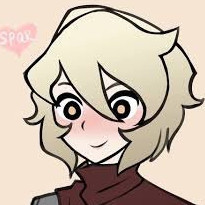
Kickern Posted February 14, 2016 Share Posted February 14, 2016 Is the red blush too much? Link to comment
Moetal Posted February 15, 2016 Author Share Posted February 15, 2016 @Kickern Yeah the red blush is too much. It's like a clown make up now. Link to comment
Evilicious Posted February 15, 2016 Share Posted February 15, 2016 (edited) Hi, first post yay... ok moving on... here is my take at porygon Now it'ss time for the xtremecutesy-inator muhaha [spoiler] version notes: dex notes pory as a mon of data and totally manmade so i aim for a gynoid vibe kind of magnetron waaay back hence the onepiece suit; also i have intended for a bulky armor pieces on shoulders and a hand cannon... feel like a samus clone so maybe a power gauntlet work better idk Yeah... i cant draw a hand for dear life and the front leg just came of as a weird lump oh and the eyes >_< i try to make them solifd green and end... urg... so...litle help please? Also the hair is intended as silver...or something[/spoiler] Original pory for pallete Porygon V1.0 Atack of the pallete swap. Also made better armor Porygon V 1.1 Edited February 16, 2016 by Evilicious Link to comment
OtherPlayers Posted February 15, 2016 Share Posted February 15, 2016 Hitting my limit on these two. Two nitpicks on the one on the right (Rhydon?): 1) her mouth is outlined very strongly in black, which makes it look more like a part of her armor instead of part of her face. Softening that outline (or removing it altogether as on rhyhorn) might go a bit towards pulling that face together a tad bit more. 2) There's two small pixel points where the outline of her skirt stutters just to the left of the garter connection on her left leg (our right). (Specifically at the pixels 1 left from the red garter and 4 left). Darkening those connection spots (or even making them black like the rest of the skirt border), will prevent the skirt from merging with her leg visually. Other then that I'm not really seeing any problems with them myself. :) Link to comment
CrookedWings427 Posted February 16, 2016 Share Posted February 16, 2016 (edited) @moetal What about that one persian sprite from awhile back? Edit: Edited February 16, 2016 by CrookedWings427 Link to comment
Moetal Posted February 16, 2016 Author Share Posted February 16, 2016 (edited) @CW The tongue is out of place in my opinion, or at least poorly executed. The hair style is a bit confusing to me as the front and backsprite don't match very well. The front sprite's ears seem too far apart and "out" of the head. The backsprite's right ear (her left) looks a bit high. The overall black outline and only two tones for the skin makes it look like a draft rather than a complete sprite. Edited February 16, 2016 by Moetal Link to comment
Septentrion Posted February 16, 2016 Share Posted February 16, 2016 (edited) @Evilicious Since there's only one "legit" evolution after polygon, I think she should be a bit bigger. The size shouldn't be something to require bent knees though. The head needs to be bigger as well. I don't like the gloves in a fist, as that implies so punching. I would also suggest that the eyes not have an unique color on the palette in this case. Make sure you have plenty of comparable sprites for reference. Proportions and art should match. This is how you want posts to look like(I made no edits). fyi: The typically resize setting is "Nearest Neighbor" in Paint.net. It's hard to compare two 64x64 sprites. Edited February 16, 2016 by Septentrion Link to comment
Evilicious Posted February 16, 2016 Share Posted February 16, 2016 @septentrion Yeah the size is an issue...i tried to make her mid size but skimped to much any pointer?... well then glowing gauntlets Ir*nm*n style? The head... 2 pix plus will do? The eyes ... they give me nightmares... will do something about pix size Link to comment
CrookedWings427 Posted February 16, 2016 Share Posted February 16, 2016 (edited) @moetal Is this any better for the front sprite? can someone science this one with the original? I lost a lot of quality fixing the palette, it was like a hundred colors. Edited February 16, 2016 by CrookedWings427 Link to comment
laGashetaHardcore Posted February 16, 2016 Share Posted February 16, 2016 a little porygon :c ??? Link to comment
OtherPlayers Posted February 17, 2016 Share Posted February 17, 2016 a little porygon :c ??? I like her but I feel we need to see more of her arms. Right now she looks like a double amputee. :P Link to comment
Arisa Posted February 17, 2016 Share Posted February 17, 2016 (edited) Ignore this. Edited August 29, 2016 by Arisa Link to comment
Evilicious Posted February 17, 2016 Share Posted February 17, 2016 (edited) Hello again... look at these[ [spoiler]so... i tried another pose and now the arms look like meh, all in all i think maybe can be used please dont mind the eyes, they are place holders more or less In other thougt how ditto is going? Thos is kind of random but how about a purple spy or something? I mean ditto hijacks other mons kinda that guy from mission imposible sooo...just a tought how about it? This is justfor fun...kinda [/spoiler] Porygon v1.2 @hardcore:cute!!! I want that for trainer!!! Edited February 17, 2016 by Evilicious Link to comment
Slash Posted February 17, 2016 Share Posted February 17, 2016 (edited) @moetal Is this any better for the front sprite? can someone science this one with the original? I lost a lot of quality fixing the palette, it was like a hundred colors. Looks really neat :D ! But I'd put her in a one piece suit. a little porygon :c ??? Cute! Is it Porygon 1 or 2 ? Kickern, on 15 Feb 2016 - 12:40 AM, said: Is the red blush too much? Yes ^^; OtherPlayers, on 12 Feb 2016 - 01:10 AM, said: Even if it's not perfect IMO it's still definitely way better than that horrible blob of soul staring that currently encompasses the being of ditto. (■_■) :P I still Vote for deleting the backpack and giving the mascot ditto eye and mouth :) Edited February 17, 2016 by Tyrone Merged posts Link to comment
Slash Posted February 17, 2016 Share Posted February 17, 2016 [quote name="laGashetaHardcore" post="1222328" timestamp="1455654504"] a little porygon :c ??? [img]http://i67.tinypic.com/211qour.jpg[/img][/quote] Cute! Is it Porygon 1 or 2 ? [quote name="Kickern" post="1221419" timestamp="1455493226"] Is the red blush too much? [img]http://i64.tinypic.com/2dm811z.png[/img][/quote] Yes ^^; [quote name="OtherPlayers" post="1219993" timestamp="1455235849"] Even if it's not perfect IMO it's still definitely way better than that horrible blob of soul staring that currently encompasses the being of ditto. ([color=rgb(0,0,0)][font=Arial][size=1]■_■)[/size][/font][/color] :P[/quote] I still Vote for deleting the backpack and giving the mascot ditto eye and mouth :) Link to comment
Moetal Posted February 17, 2016 Author Share Posted February 17, 2016 (edited) @CW The body is much better, but I think the different eyes/face shading make it looks as if the eyes are too far apart now. I also feel you are over-smoothing the hair and causing it to lose details. @Hardcore There's some minor issues here and there, but it captures the feeling of Porygon pretty well. I think her right eye is a pixel too high and her left (our right) leg is too long when putting her pose into consideration and comparing it to her other leg. Edited February 17, 2016 by Moetal Link to comment
Munya Posted February 17, 2016 Share Posted February 17, 2016 Looks really neat :D ! But I'd put her in a one piece suit. Cute! Is it Porygon 1 or 2 ? Yes ^^; I still Vote for deleting the backpack and giving the mascot ditto eye and mouth :) Can you please use the multiquote button instead of posting multiple times in a row Link to comment
CrookedWings427 Posted February 17, 2016 Share Posted February 17, 2016 (edited) @Slash I was thinking about a one piece suit, however i really like the small detail of the back arch. im simple ._. @moetal i was thinking someone should just science the old face back on her, i think the old face is very persian a lot of detail was lost because i had to manually fix the palette... meaning i cleared out all shading and detailing and redid it ._. probably shouldnt have done that when i could have asked someone to fix the palette before i played around with it. i was thinking of getting rid of the bikini bottom and making it a skirt to match new meowth more, from school girl to sexy school girl? or something like that. Hopefully I can finish meowth tonight. Since I've started playing pokeMMO i wanna fix my team up ._. Which means I need to fix staryu, starmie, and hitmonlee. Moetal, what did you think of the Cloyster Starmie? Edited February 17, 2016 by CrookedWings427 Link to comment
Kamigoroshi Posted February 17, 2016 Share Posted February 17, 2016 (edited) Personally, I always was quite fond of this Staryu here from the Japanese moemon upload site. Nothing says psionics better than floating weaponry. Also, Battle Loli -> Pinup Model. And yes, that is the final version the artist drew. Its earlier versions were quite... scary. In a Picasso meets The Ring kind of way. All I did was to change her colour palletes a bit. Oh, and here's also some edited Yangire Gligar goodness as well: Not the best edit of mine, imho. The lack of available slots for another skirt colour drove me half mad while working on it... But suffice to say, it fits the bill for my casual gaming needs. Edited February 17, 2016 by Kamigoroshi Link to comment
missiri Posted February 18, 2016 Share Posted February 18, 2016 (edited) @cw the belly on that persian should be moved up one pixel midway along like the source if possible :huh: . the straight line is throwing me off. other than that I'm loving the fact you are giving the meowth line some love thank you. I adjusted it a little may have made it worse Edited February 18, 2016 by missiri Link to comment
laGashetaHardcore Posted February 18, 2016 Share Posted February 18, 2016 (edited) gligar :3 Spinarak and fixed porygon?? please help with clefairy!! D: Edited February 18, 2016 by laGashetaHardcore Link to comment
CrookedWings427 Posted February 18, 2016 Share Posted February 18, 2016 (edited) @kamigoroshi Idk something about that starmie doesnt seem to fit in with the rest of the moemon Shes very cluttered and her actual body is small. @missiri I will continue with your edits and might make some of mine along the way to me persians head is too wide, if i move the right side of her head (our left) one pixel in it should fix a lot of it, i still prefer the original eyes so I'll probably edit those back in. You're very welcome :) I like meowth and persian a lot, so im happy to do this. @hardcore I like the gligar a lot. Also that porygon still needs arms. Not sure what to do to clefairy, does she have a backsprite? i could try my hand after i finish the meowth line. Edited February 18, 2016 by CrookedWings427 Link to comment
Evilicious Posted February 18, 2016 Share Posted February 18, 2016 (edited) @CW sexy schoolgirl... tie and all? Im sold! Im the only one unable to reach tinypic? Edited February 18, 2016 by Evilicious Link to comment
laGashetaHardcore Posted February 18, 2016 Share Posted February 18, 2016 (edited) @CW yeah this is the backsprite of clefairy and spinarak >w< Porygon whit arms the progress QwQ Edited February 18, 2016 by laGashetaHardcore Link to comment
MarinoKadame Posted February 18, 2016 Share Posted February 18, 2016 The Clefairy backsprite would need a side view to see her face in my opinion. Link to comment

Recommended Posts
Create an account or sign in to comment
You need to be a member in order to leave a comment
Create an account
Sign up for a new account in our community. It's easy!
Register a new accountSign in
Already have an account? Sign in here.
Sign In Now