peachnkey
-
Posts
27 -
Joined
-
Last visited
11 Followers

.thumb.jpeg.4431fee3a7ad8f86e520d545546aa0c3.jpeg)

peachnkey's Achievements
-
 Crueldad reacted to an answer to a question:
Vanity Suggestion Thread
Crueldad reacted to an answer to a question:
Vanity Suggestion Thread
-
mamoru reacted to an answer to a question:
Vanity Suggestion Thread
-
Kostch reacted to an answer to a question:
Vanity Suggestion Thread
-
 goldenshoot reacted to an answer to a question:
Vanity Suggestion Thread
goldenshoot reacted to an answer to a question:
Vanity Suggestion Thread
-
 SyaChan reacted to an answer to a question:
Vanity Suggestion Thread
SyaChan reacted to an answer to a question:
Vanity Suggestion Thread
-
Palafo reacted to an answer to a question:
Vanity Suggestion Thread
-
peachnkey reacted to an answer to a question:
Vanity Suggestion Thread
-
ZarkoZX reacted to an answer to a question:
Vanity Suggestion Thread
-
Amyllia reacted to an answer to a question:
Vanity Suggestion Thread
-
CheshireRose reacted to a post in a topic:
[WIP] Pichiki's Updated Shiny Sprites
-
DooMevil reacted to an answer to a question:
Vanity Suggestion Thread
-
This has probably been suggested before, but there are a lot of custom NPC sprites with outfits/hairstyles that are designed wonderfully. I think it would be nice to implement these as cosmetic options for the players. As a side note, I would personally LOVE if the calm eyes looked more like the calm eyes of the shrine maiden NPC, they look much more polished and the blush is a nice touch!
-
peachnkey reacted to a post in a topic:
~Porygon’s Yuletide Canvas: An Artistic Celebration~
-
peachnkey reacted to a post in a topic:
~Porygon’s Yuletide Canvas: An Artistic Celebration~
-
peachnkey reacted to a post in a topic:
~Porygon’s Yuletide Canvas: An Artistic Celebration~
-
peachnkey reacted to a post in a topic:
~Porygon’s Yuletide Canvas: An Artistic Celebration~
-
peachnkey reacted to a post in a topic:
~Porygon’s Yuletide Canvas: An Artistic Celebration~
-
peachnkey reacted to a post in a topic:
~Porygon’s Yuletide Canvas: An Artistic Celebration~
-
peachnkey reacted to a post in a topic:
~Porygon’s Yuletide Canvas: An Artistic Celebration~
-

~Porygon’s Yuletide Canvas: An Artistic Celebration~
peachnkey replied to DragoTamer's topic in Unofficial Events
Oh! Are we supposed to attach proofs of progress :o? Unsure if its needed but JIC here's a pic of some layers turned off and the initial sketch ^O^!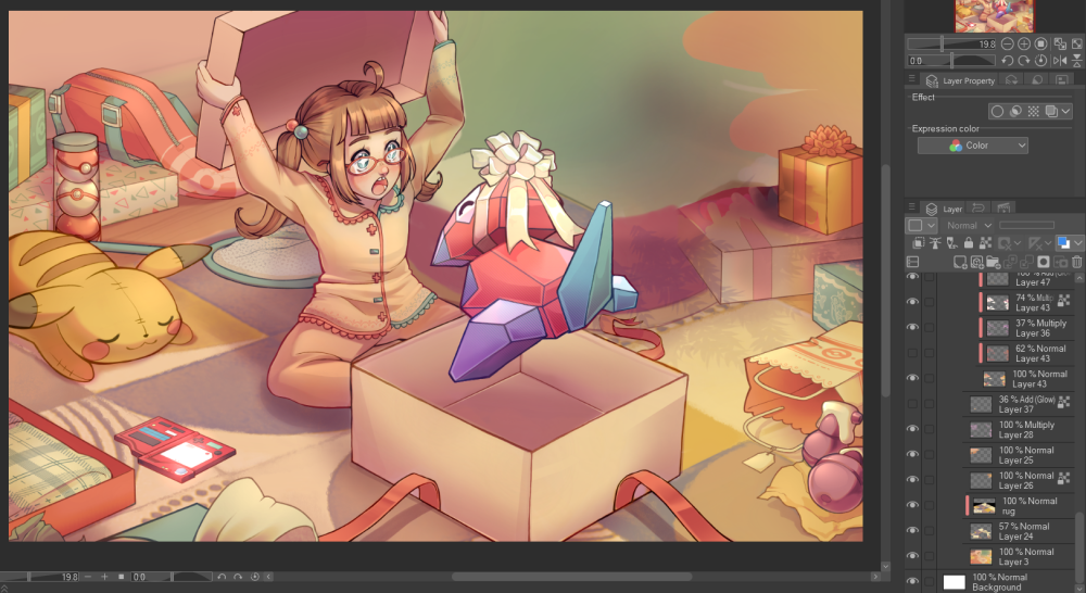
-
peachnkey reacted to a post in a topic:
~Porygon’s Yuletide Canvas: An Artistic Celebration~
-
peachnkey reacted to a post in a topic:
~Porygon’s Yuletide Canvas: An Artistic Celebration~
-
~Porygon’s Yuletide Canvas: An Artistic Celebration~
peachnkey replied to DragoTamer's topic in Unofficial Events
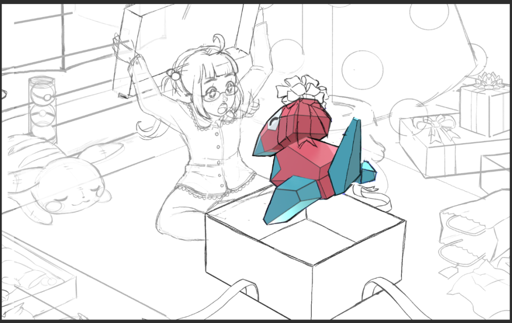
Merry Chrismtas everyone ❤️ and Happy Holidays! Here's my entry, I had a lot of fun with it! I haven't done a fully colored peice with a background and everything for a long time and thought this contest was a great oppurtunity to stretch my art muscles. I tried to tell a little story here of a soon-to-be trainer getting her Christmas presents for the year, and I hope everything comes across well. I struggled a bit with the tree and the prespective and things, but overall I'm really proud of this peice. Thank you so much for hosting ^O^!- 59 replies
-
- 17
-
-
-
[Money Guide] Community Pickup Guide (2nd Edition)
peachnkey replied to Bestfriends's topic in Guide Tavern
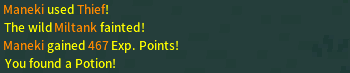
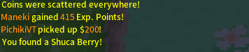
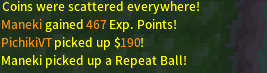
For Johto Rt 38 Player pickup -- Potion --Shuca Berry Pokemon Pickup --Ice heal -- Repeat ball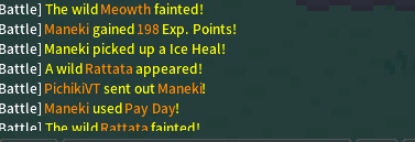
-
amazing mod! super simple but super helpful, thank you for making it ❤️
-
[WIP] Pichiki's Updated Shiny Sprites
peachnkey replied to peachnkey's topic in Client Customization
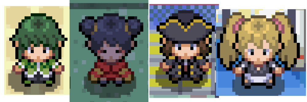
Final round! The rest of the Unova dex along with some stragglers I forgot to put in the image along the way, haha, oops. The Gothorita line is honestly the one I'm most proud of. I simply exaggerated what made Gothitelle look kinda okay and then made the rest match and now it's very very nice in my opinion :D! I did the same with Deerling and Sawsbuck. It seemed like they tried to make their shinies brighter than the originals, but didn't pushed it far enough, so I made Deerling white and Sawsbuck a light gray. Swanna and Ducklett both get exaggerated. I tried to make Swanna look like Odile, the black swan, and made Ducklett's colors a little cooler. I also pushed the pink and purple rocker vibe more with the Vullaby line. Emolga, the Joltik line, and the Beartic line also get simple exaggerations. Excavelier gets it's colors from shiny Shelmet's armor and I think it looks much cleaner. Ferroseed was RIDICULOUS so I made it match Ferrothorn like HOW did they mess that up lmao? Druddigon got their red and blue swapped. Durant got blue eyes instead of green. Tynamo got it's electric line changed from yellow to black. Bouffalant became darker and more purple. Let's talk about the greenies now! I'm actually rather proud of them here. First, the Deino line. I understood the concept they were going for but the originals dropped the ball. The warm green and grey with the cool purple did NOT match, so I simply kept the cool purple and made the green and gray cooler to match and like magic it actually looks GOOD now! Again folks, they aren't bad because they're green, they're bad because they're an UGLY green. Scrafty also gets that treatment with the red to blue and the cooler green to match, I also made it's shed skin the same yellow as Scraggy's. Elgyem and Beheeyem were also clearly going for a gray alien and private investigator vibe, so I instead made them little green men and the men in black respectively. Tauros becomes Paldean Tauros (as that didn't exist when I first started this project, how wild!). Finneon and Lumineon get pinked! Shiny Glaceon becomes paler and shiny Leafeon gets rightfully autumn'd as god intended. Spinda's greens are made less ugly, and Natu gets red to blue'd. And... and that's it. I think I did them all! Do let me know if there are any shinies I missed, any that you would like to see changed that are simply far too boring to be exciting to find and hunt. I want to hopefully make more hunts viable, and make common phase pokemon actually nice to look at, so if I missed one you think I should work on comment on this thread. Thanks so much for stickin' with me :D! I'll wait a good while for some feedback then get into the nitty gritty of actually making the gifs. -
[WIP] Pichiki's Updated Shiny Sprites
peachnkey replied to peachnkey's topic in Client Customization
I did a LOT of them in Unova, but Unova's original shinies overall were actually my favorite. They were either hit or miss, and I simply made most pokemon who evolved from pretty shinies retain their prettiness, or exaggerated what made them nice in the first place. The Pidove line I made purply-blue to match Pidove, the Sewaddle line matches the cool green of Sewaddle now. Venipede matches Scolipede, Petlil matches Lilligant, Cinccino matches Minccino, The Krocks match Sandile, Carracosta matches Tirtouga, Garbordor matches Trubbish, Zoruark matches Zorua. Easy-peasy shinies! I do think Zoruark still could look cooler, but I don't know how to make it as cool as Zorua to be frank. Blitzel, Zebstrika, Audino, Sigilyph, the Timburr line, the Darmanitan line, and the Archen line all get slightly exaggerated so the changes are more noticeable. Basculin gets blue'd and the other Basculin will be red'd. Oh! And Swoobat and Woobat! Those shinies are actually not just color swapped, I had to do some trickery with the pixels to make the white wings work and while again that cannot be done on official hardware (probably) I do not CARE!!! LOOK AT IT!!! PINK AND BLUE :D!!!!! -
[WIP] Pichiki's Updated Shiny Sprites
peachnkey replied to peachnkey's topic in Client Customization
The end of Sinnoh, beginning of Unova! Let's address the Phanpy in the room first and foremost, I am NOT satisfied with the Lillipup line. I think I'm on the right track-- I tried to make it white and blue to match real life malteses and how scottie dogs kinda look blue IRL-- but it feels too monochrome. If y'all think its nice looking I'll keep it, but if you agree with me and also find it off putting I'll keep working on it. I pushed what made the colors different further with Bidoof, Bibarel, Froslass and the funny monkeys. I already talked about Misdreavus and Honcrow in the first update. I kinda went ham on the Shellos line though I think West-Sea looks a little off still. Roserade, Cherrim, Gabite, and Dusknoir I made more consistent with their pre-evolutions. Cherrim also gets to be a white sakura blossom (which is a thing IRL) Burmy was a TRAVESTY so I made it white. Lucario was also a travesty, so I made it gold instead of piss-yellow. I also darkened the masks, though I might lighten them a tad. Garchomp was obvious so I did the obvious. Munchlax was also obvious with a blue to red, same with Sawk and Throh. That's about it for this one :D! -
[WIP] Pichiki's Updated Shiny Sprites
peachnkey replied to peachnkey's topic in Client Customization
Round two! Hoenn and the beginning of Sinnoh. Pelipper and Wingull didn't make sense to be green to me, so I did a classic blue to red. I also did a red to blue with Corphish and Crawdaunt. I exaggerated what differences were already there with Shedinja (to look more gold), Banette, Minun, Solrock/Lunatone, and the Piplup line. All the Piplup line really needed was a different beak although I thought a black Empoleon would look cool so I did that. Chimecho had a case of the ugly-green, so I simply incorporated the green in a way that made more sense with it and Chingling. The Salamance line had this same issue, though I'm still not fully satisfied with it. Do let me know if you also think it doesn't look right, and I'll keep chewing on it. Tropius and the Turtwig line also had a massive case of the ugly green, so I autumn'd Tropius and sakura'd Turtwig. Grotle still looks off to me, but I'm unsure what to do about it (and it's Grotle, anyway XD so whatever) Loudred and Exploud I made more green to match what made Whismur so sucessful, and I made Grumpig match what made Spoink successful as well. Carvanha and Sharpedo are an interesting case, something about Carvanha just felt off, so I switched the yellow and blue around and it just feels so much more right to me. I made Sharpedo to match, and dulled the purple a tad. OH! And OBVIOUSLY Shiny Keckleon looks like the Mystery Dungeon Keckleon. Obviously. Easiest one of these by far. -
[WIP] Pichiki's Updated Shiny Sprites
peachnkey replied to peachnkey's topic in Client Customization
Alrighty! I'm back after my long hiatus because of work, expect progress of this to be rather slow with short bursts of activity like this. Just know that no matter how long the break I'm gonna stick with it >:D! It's a relatively simple project, with time being the hardest factor. Anyhoo-- I finished all of the still-image color tests! 50 billion posts in a row are incoming since I want it to be easier for people to comment on what shinies they think need further editing, if you have any opinions on them at all please, please let me know ❤️ I don't want them to look cool just to my tastes, but to as many peoples tastes as possible. I also learned a valuable lesson as I was working on these: Green shinies are not bad because they are green, they are bad because they are an EYE-BLEEDING shade of green. If a shiny was green, I tried to keep it so if it made sense for the pokemon. Sometimes, it made more sense for a shiny to be green than any other color. Some of the greens I have chosen I think are perfect, while others I think need work and still look off. If you think my greens are still an eyesore however, do let me know! Here's the Johto mons and the start of the Hoenn mons. The official shiny is on the left while my edit is on the right for each, and as I've done before I'll explain my thought process behind my choices here. With Lanturn I tried to capture the magic that made Chinchou look so great, it will look either kinda purply blue or REALLY blue depending on your monitor, though. Sunkern and Sunflora I made into an autumn variant. Nuzleaf and Shiftry also got autumn'd. Murkrow and Honchkrow (which i forgot to add next to Murkrow it'll be shown later) I tried to keep the original concept of "pink and purple crow" in tact, leaning into the dark type and witchy vibes by making them more purple. Misdreavus was an ugly green, though I get they were going with a slimer-ghosty type of vibe I just said screw that and made it a ghostly blue and purple. Scizor I made a less eye-bleeding green. I did the same to both Heracross and Ursaring, making Ursaring match Teddiursa more. Phanpy got the pink treatment both to make it cuter and to help it match it's Coppery evolution. Houndour and Houndoom were both eye-bleeding AND had some weird issues with them that technically probably couldn't be done on cartridge but this is a mod changing image files, I can do what Gamefreak actually intended. Masquerain had a case of the ugly-greens and so I made it not that, and more blue. Stantler became Wyrdeer, Larvitar matches Tyranitar, Blissey/Happiny match Chansey and Piloswine/Mamoswine match Swinub. With Mantine, Mantyke, Elekid, Combusken, and Smoochum I simply pushed what made the shinies different from their original counterparts to help them look a little more different. Again and as always, do let me know your thoughts! EDIT: I forgot to mention, shiny Espeon! I based the colors off of tumblr user the-chibster's take linked below. I know some people like the green alien vibe, it reminds me of the Alien Aisha from Neopets actually hehe, but I just think this works more overall. Maybe i'll make an alternate mod to make it look like this lovely art by aerithcat linked below. https://the-chibster.tumblr.com/post/170211841888/shiny-espeon-please-god-that-one-hurts-me-so https://www.deviantart.com/aerithcat/art/shiny-espeon-973751353 -
[WIP] Pichiki's Updated Shiny Sprites
peachnkey replied to peachnkey's topic in Client Customization
Hell yea hell yea >:D These look awesome! -
GIVE US THE WALKIES
-
How to redeem coins from Voltorb flip in johto casino?
peachnkey replied to AsterinoMaculato's topic in General Discussion
Is it a balancing thing? Cause I've noticed the same! Think it would be a really fun way to get some porygon. -
I decided to save up the random dragon breeders I'd catch in my day to day, and now the box is full! I'm looking to sell, 60k or any value of equal offer. I've never traded boxes before, so I might be a little slow on the uptake but I get the gist of it. Mail me here or in game for any offers ❤️ thank you!

-
These look amazing :D!!!