Lunaryk
-
Posts
6 -
Joined
-
Last visited
Lunaryk's Achievements
-
 Lunaryk reacted to a post in a topic:
[GUI] Pokemon Volt White, Black Soul, Generation Marnie POKEMMO THEME (compatible with new updates)
Lunaryk reacted to a post in a topic:
[GUI] Pokemon Volt White, Black Soul, Generation Marnie POKEMMO THEME (compatible with new updates)
-
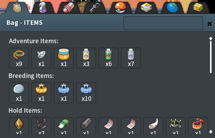
 Hey there! Really love your theme! I'm using the "POKEMON VOLT WHITE PURIZUMU WIND" version and it's really hard to see the different tabs in the bag: Unlike on the default version: I think they should have a different background or something to fix it. Thanks a lot for bringing us this theme!
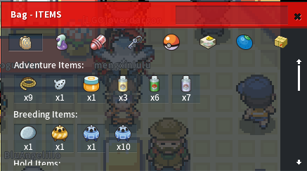
-
Lunaryk reacted to a post in a topic:
[GUI] Pokemon Volt White, Black Soul, Generation Marnie POKEMMO THEME (compatible with new updates)
-
Lunaryk reacted to a post in a topic:
[GUI] Positive-Dark Theme
-
Lunaryk reacted to a post in a topic:
[GUI] PokeMMO UI Redesign Concept
-
 SonecaBS reacted to a post in a topic:
GEN 8 STYLE THEME + MODS - (WIP) android/pc support
SonecaBS reacted to a post in a topic:
GEN 8 STYLE THEME + MODS - (WIP) android/pc support
-
Lunaryk reacted to a post in a topic:
[GUI] POKE RIVALS v1.0
-
Aunow reacted to a post in a topic:
GEN 8 STYLE THEME + MODS - (WIP) android/pc support
-
Lunaryk reacted to a post in a topic:
[GUI] GALAR MODE (ACTUALIZED)
-
GEN 8 STYLE THEME + MODS - (WIP) android/pc support
Lunaryk replied to JaredNattyDaddyTKL's topic in Client Customization
Yeah I do! -
GEN 8 STYLE THEME + MODS - (WIP) android/pc support
Lunaryk replied to JaredNattyDaddyTKL's topic in Client Customization
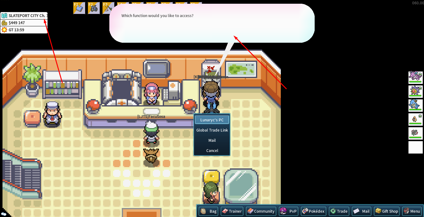
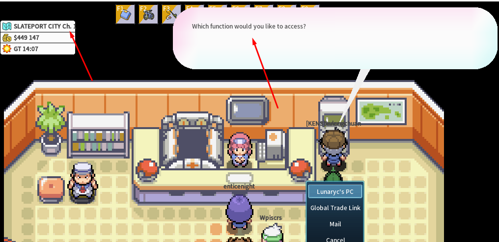
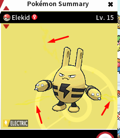
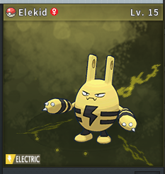
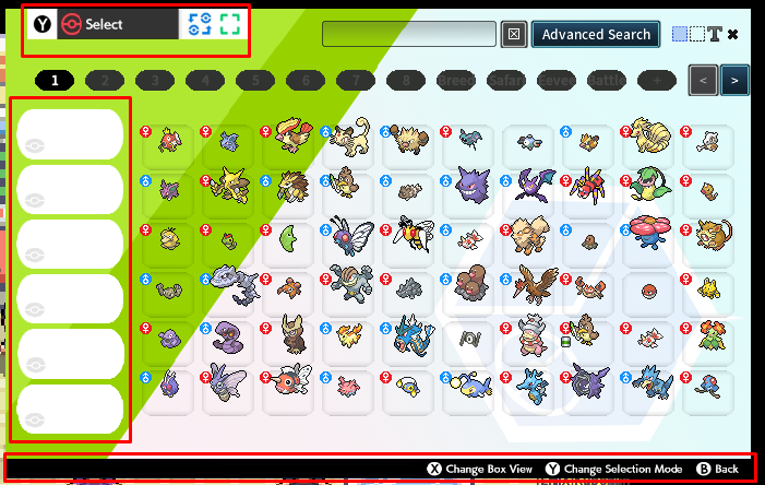
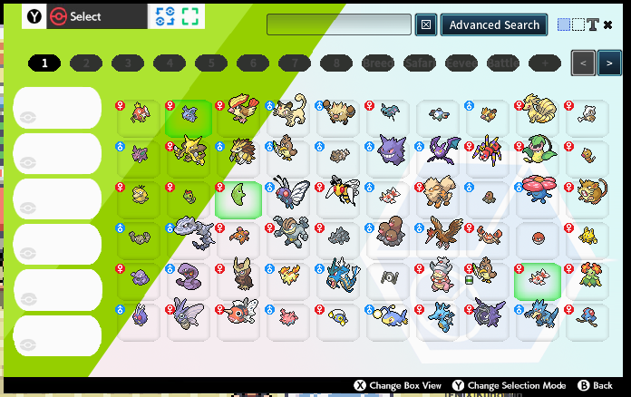
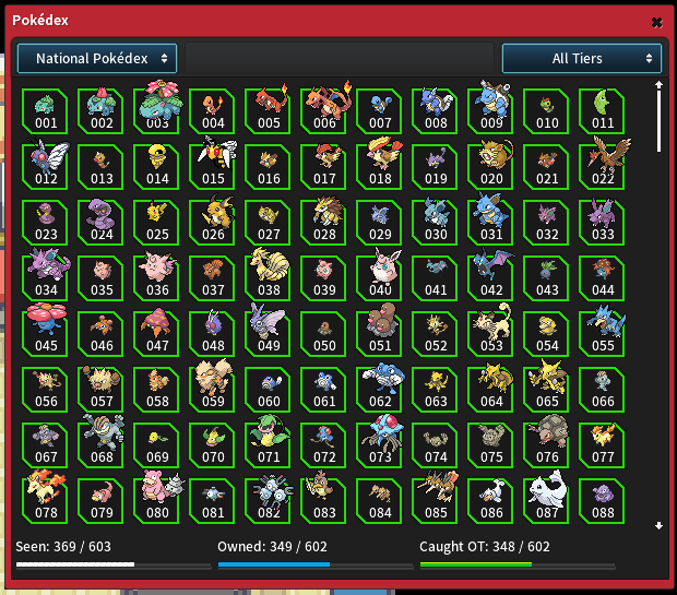
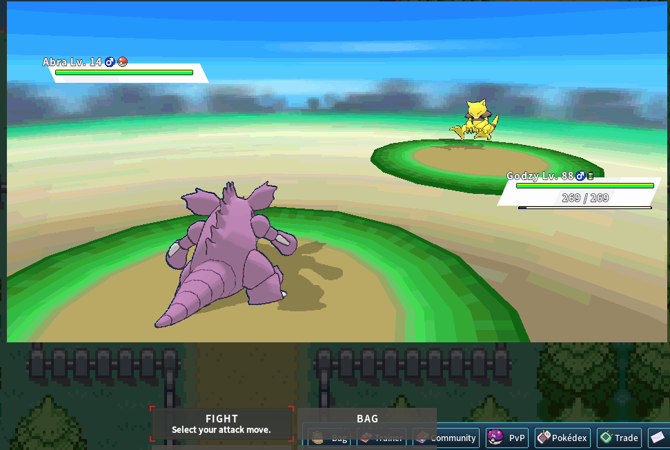
The thing is, they aren't really visible :/ Why not make them all white with black background (like the current selected one), but make the selected one with a different background so it stands out while the other boxes are also very clear. I'm finally back to give my full feedback. So let's get it started! First, I'd like to thank you a lot for all the work and effort you did to make this package. Once finished, it will definitely be the best theme+mods for pokemmo. But currently, it have many issues (some which makes it unusable). I will try to go over everything your package have to offer even if it's already mentioned in the known issues and give a screenshot for each of it in order to be as complete as possible. You could say that I really love this mod and this is my way of contributing to it. I really hope it gets completed soon so I can start using it correctly. Important notice: I play on computer and it's resolution is 1366x768. 1/ Text size: The text in the bubbles is very small and different from the default theme. The name of some areas is cut if they are long enough 2/ Combat: The text and battle interface are out of the screen. They are also not clickable by the mouse. This is definitely the top priority thing to fix as it makes the mod unusable for those with the same resolution (not everybody likes to change their settings just to make a theme work) 3/ Pokemon Summary: The interface have some useless button that made me confused at first (Why can't I click on them? XD). So it would be nice to remove them to keep the UI cleaner. In case you didn't know, pokemons have some special effects on their summary depending on their type. But some of the backgrounds of your theme actually make them impossible to see (I gave an example with the electric type, but many types have this issue). The original theme you used also had this problem. 4/ PC Storage: The PC Storage is a very important part in the experience of Pokemmo (even more than other pokemon games) since it's where all your pokemons are stored (and you can get tons of them here since it's 4 games). It can quickly get filled and messy which makes clarify extremely important on it. I would love if the 3 areas I highlighted get removed as they don't serve any purpose and only make it seem like a copy of the console game. I hate how those are taking precious space that you could use to make the pokemons much bigger (like in the default theme). The green area on the background also makes it hard to spot pokemons of certain colors (like green). I think removing the green area would help a lot. As I mentioned before, the storage is a very important part of the pokemmo experience and one of it's key features is the search bar. It helps a lot to find a specific pokemon or for those that have a certain nature (which is important for breeding). The current search selection could definitely use some love and get clearer. It's even worst on the green area (look at the female Nidoran). 5/ Trainer card: In the screenshots you sent, your trainer card shows 6 pokemons at it's top right corner. I assumed those are the pokemons that you used to beat the elite 4. Nothing appears there for me even if I'm in a region where I already beat the Elite 4. Did I understand the feature wrong? How is it supposed to work? 6/ Item shortcuts/Hotkeys: In the screenshot you sent, those have a blue background (like the menus while for me, they are half white half yellow. I would love if they were blue like your own screenshot. 7/ Pokedex: I don't want to sound mean, but that kind of green on a black background really hurts the eyes especially since it's a long list of pokemons with small icons. It also seems out of place compared to the rest of the theme. It would be nice if you changed the colors to be more in line with the rest of the theme. 8/ Informations about each mod: It would be really nice if you wrote a short description of what each mod does and how is it different from the original one (if there is any difference) Your list of features include "new GUI elements and features". What are those exactly? Does the mod "SW/SH MAIN TITLES SCREEN / MUSIC (Place the zip folder in mods) PC ONLY" do anything beside changing the music in the title screen? If that's the case, couldn't you have included that in the "REMASTERED MUSIC" mod? Are the "REMASTERED MUSIC" and "SW/SH + VERDEP MODELS" any different from the originals (you know, like the mod made by VERDEP)? Hope that was helpful! And I really hope I didn't miss anything. I will be looking forward to your reply.


-
GEN 8 STYLE THEME + MODS - (WIP) android/pc support
Lunaryk replied to JaredNattyDaddyTKL's topic in Client Customization
Yes, the currently selected box is very clear. But it would be nice if the others were a bit clearer too. -
GEN 8 STYLE THEME + MODS - (WIP) android/pc support
Lunaryk replied to JaredNattyDaddyTKL's topic in Client Customization
I also do the same for most of them, but it's true that the grey on black isn't super visible. Speaking of which, I made an account specifically to thank you about this theme because it's really awesome. I'll give you a more detailed feedback as soon as I can.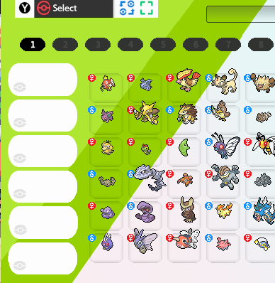
-
Lunaryk changed their profile photo
-
GEN 8 STYLE THEME + MODS - (WIP) android/pc support
Lunaryk replied to JaredNattyDaddyTKL's topic in Client Customization
I'm pretty sure he meant the colors and not the size of the text